
Anime art and flat color
Inspect hair and clothing outlines, shadow boundaries, broad color fields, and narrow highlights. Look for grain or invented-looking patterns in flat areas and halos that were not present around the original edges.
ILLUSTRATION WORKFLOW
When a small artwork needs a clearer presentation, review line weight, broken strokes, flat-color regions, gradients, and lettering separately. Kogashitsuka AI lets you compare original-size processing with 2x and 4x output through its shared image workflow.
This page does not claim a model trained only for anime or line art. Treat every result as a rendering of the pixels in your source, and verify whether the edges and color treatment still suit the artwork.
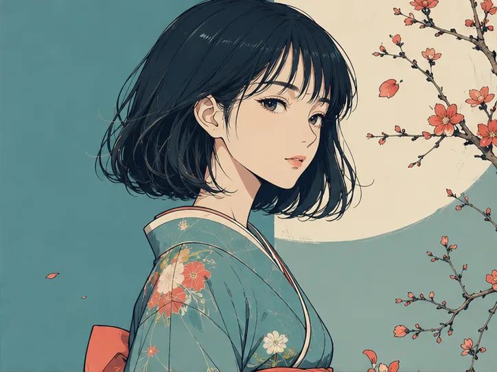
READ THE ARTWORK
The aim is not to add photographic texture to every drawing. Outlines, flat areas, subtle shading, lettering, and deliberate roughness each need their own review at both full size and the final display size.
Inspect hair and clothing outlines, shadow boundaries, broad color fields, and narrow highlights. Look for grain or invented-looking patterns in flat areas and halos that were not present around the original edges.
Check broken fine strokes, filled intersections, and moire in screen tones. Even monochrome artwork can show compression artifacts, so inspect clean paper areas as carefully as the drawn lines.
Watercolor-like transitions and soft shading can become rigid if processing overstates an edge. Evaluate the flow between colors and the intended brush character instead of judging sharp contours alone.
For artwork displayed small, legibility at the final size matters more than microscopic detail in the large output. Inspect outlines, text padding, transparent edges, and the asset on its intended background.
THREE PASSES
A practical workflow begins with the best available source, selects only the dimensions needed, then checks the image at both 100% and the actual size where viewers will see it.
Prefer the JPEG, PNG, or WebP exported from the project over a copy downloaded from social media. For transparent artwork, verify the background and fringe both before and after processing.
Work backward from the posting or print dimensions. Use original size to refine readability, 2x to create reasonable layout room, and 4x only when the destination actually needs a substantially larger raster.
Inspect stroke endings and color boundaries at 100%, then reduce the image to its real placement size. If crisp detail changes the softness, balance, or direction of attention, compare another setting.
EXPORT NOTES
Thinner is not always better for a line, and a harder edge is not always more faithful. Use the original stroke width, antialiasing, and intentional texture as references when deciding whether an output remains suitable.
A flat-color region can look clean in the center while developing an unwanted rim near its boundary. Review both light and dark backgrounds, and compare the image at normal viewing size as well as close up.
For posters or speech balloons, readable text is only one concern; the letterforms must also remain correct. If tiny type is already ambiguous, replace it from the editable project instead of relying on a generated-looking interpretation.
For print, increasing pixel dimensions and changing a dpi field are not the same task. Confirm final physical size, required resolution, bleed, and color requirements with the printer, then inspect the placed output in the final layout.
KEEP IT HONEST
The tool processes a finished raster image. It does not reconstruct layers or editable vector paths, so re-exporting from the project remains the better option when the original working file is available.
A line removed by severe downsizing, a shape covered by paint, or unreadable lettering cannot be assumed to return exactly as the artist intended. Compare any new-looking detail against the original work.
This is raster image processing, not automatic tracing into paths for editing in Illustrator or similar software. The enlarged result remains a pixel-based image.
The workflow is not designed to restyle a drawing or add selected missing objects. Its role is to process the composition already present and let you compare whether that result serves the intended use.
ARTWORK FAQ
Edge appearance can change with the input and setting. Inspect fine lines, intersections, and stroke endings at 100%, then choose the result that stays closest to the intended line weight.
A JPEG, PNG, or WebP artwork can be uploaded, but the process is not an anime-only feature. Compare flat colors and outlines carefully for any texture or edging that does not belong in the original.
After downloading, place the output over the background colors it will actually use. This makes a pale fringe, dark halo, or color bleed around transparent edges much easier to notice.
It may become easier to see when enough of each letter remains, but exact recovery of crushed type cannot be promised. Rebuild important wording from the source document whenever possible.
CHOOSE THE JOB
This page centers on lines and color fields. Continue to the photo page for people and old records, the enlarger for pixel-first work, or the Illustrator article for placement and export settings.
Use the actual homepage uploader to select the image, inspect its planned output dimensions and required points, and process only after those details match the job.